
Logo Usage Guidelines
The Cooper Norcross Health logo and brand mark are the official graphic representations of Cooper Norcross Health to be used in communications, on signage, specialty items, and apparel. Cooper Norcross Health also has special purpose logos for limited use cases.
Our brand logos must always appear in their entirety and in their correct formats, withour alteration. Our logos may never be combined with another organization’s name or logo unless a part of a legal joint venture.
Read below for more guidance on using our logos correctly, how not to use them, and best practice.
Questions about logos or requests for graphics that incorporate one of our logos should be sent to BrandCentral@cooperhealth.edu.
Cooper Norcross Health
The “C” combined with the health system name, as either a stacked graphic or a single-line graphic, are the official graphic representations of Cooper Norcross Health. Either logo may be used for branded communications, marketing and advertising, signage, stationery and business cards, and specialty items and apparel.


Standalone “C” (Limited Use)
The primary use of the Cooper Norcross Health “C” is as a social media avatar, website favicon, instead of headshot in virtual meeting applications such as Microsoft Teams, and certain other limited marketing applications. Requests for other uses should be directed to BrandCentral@CooperHealth.edu.

MD Anderson Cancer Center at Cooper
The MD Anderson Cancer Center at Cooper logo must not be altered in any way. The logo must always be represented in two colors. The preferred logo is red and black with the red strikethrough. In some cases, the institution names may be represented in all white or all black, but the strikethrough must always be in red.

Logotype
The brand logotype – the font representing the Cooper Norcross Health name – is Montserrat, which is an open-source typeface. Montserrat may be for titles/headings in presentations and documents.
Corporate Color
To enhance our identity and ensure consistency, a specific color red, has been designated for the Cooper Norcross Health brand. The logo may also appear in black or white. Background color has a significant impact on logo visibility. Be sure to use a background color that provides strong contrast for the logo.
Area of Isolation
A reasonable amount of clear or white space around the brand must always be maintained. The “area of isolation” should never be closer than the height of the letter “C” in the word “Cooper” or, if possible, the height of the “C” brand mark. When possible, use a more generous spacing.

Logo Misuse
Maintaining the integrity of our logos is essential. Always use official digital logo files. Below are some examples of ways in which the logo should not be used.
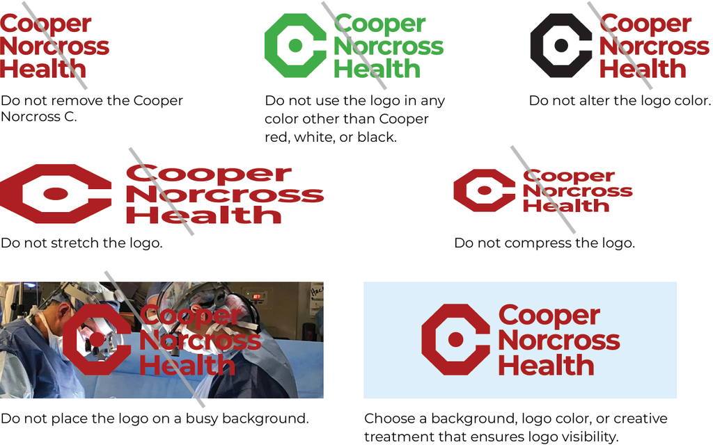
Best Practices for Logo Use
- Never alter, add to, or redraw the logos in any way.
- Never rearrange the elements of our logos.
- Never modify the typeface of the logos.
- Do not create your own logos.
- Use only the files provided.
- Use the logos only in the official red, black, or white. Never change the colors in the logos.
- Reproduce the red logo on a solid white (preferred) or light-colored background to maintain readability.
- If you need a custom logo for a specific purpose, the request must be made to Cooper’s Brand Manager.
For additional information, contact the Communications and Marketing Department at BrandCentral@cooperhealth.edu.